Admins could not prove Calendly’s value
Calendly could show that meetings happened, but not how scheduling affected the business. Admins assembled answers by hand, executives questioned the investment, and more than 60% of at-risk enterprise accounts told Customer Success they could not see what they were paying for.
“Account managers lacked visibility into team scheduling metrics, making it hard to justify renewals — or trust that Calendly still mattered.”
- Adoption: 40% of orgs with 20+ seats
- Retention: half still using it after a month
- Satisfaction: 70%+ CSAT
The opportunity came with three risks: chart rendering had never been tested at enterprise scale, idle-seat data could undermine renewals, and Calendly had no chart components to build from.
Admins needed slide-ready proof, not more charts
Research across ten scheduling tools and 30 enterprise customers reframed the brief: admins did not need more numbers; they needed a decision. That led to three product principles — interactive exploration, charts that stayed legible in executive slides, and control over which signals appeared.
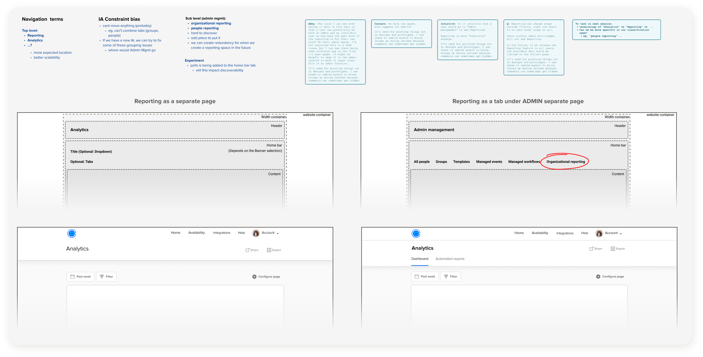
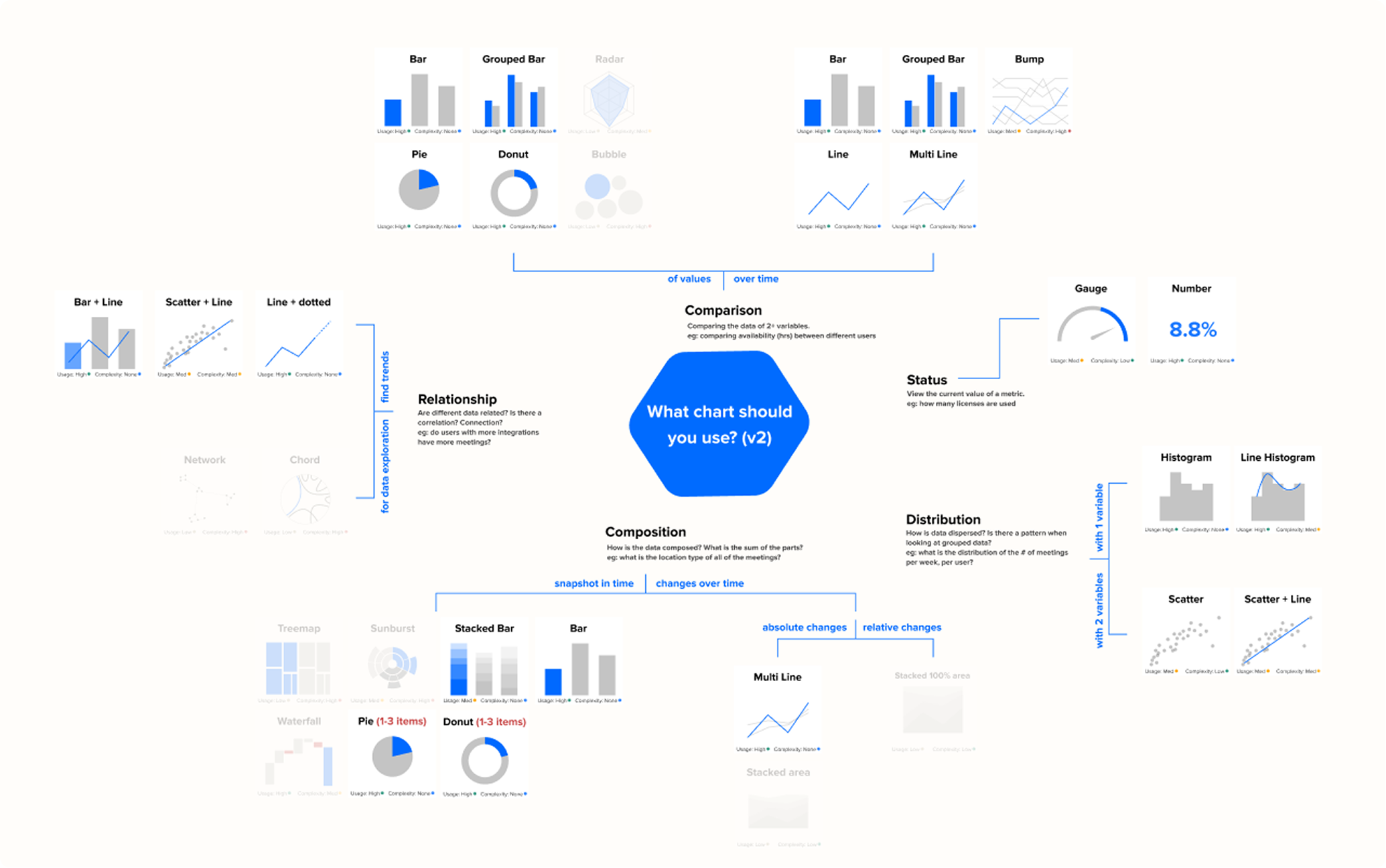
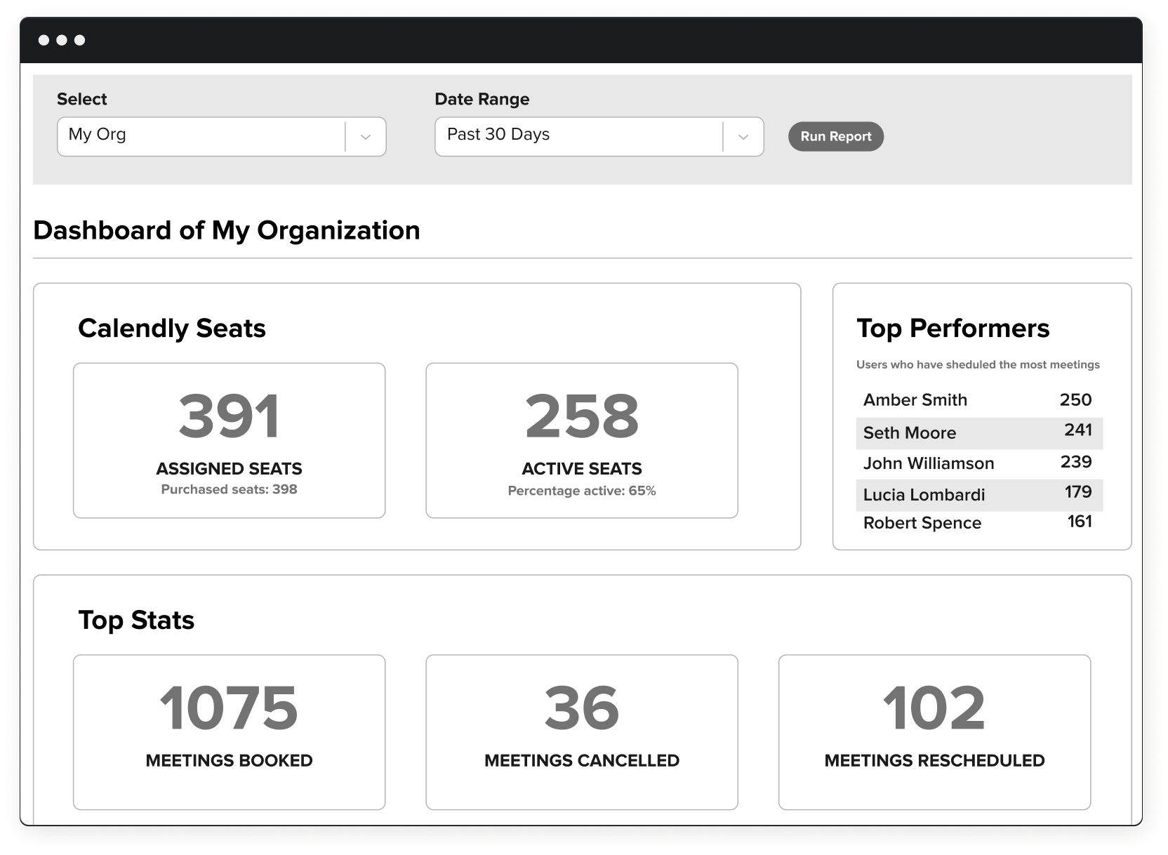
I tested two dashboard models: dense cards for fast comparison and a card-free layout with more room for trends. The final system combined strong default views with drill-down and per-admin customization.
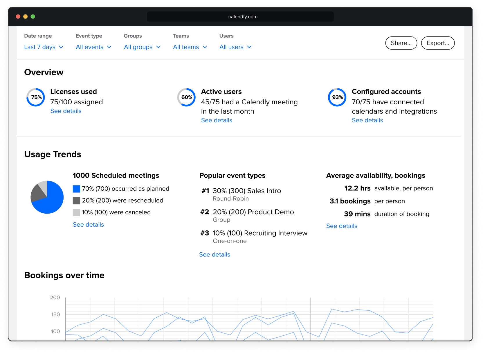
90% adoption and stronger expansion
| Metric | Goal | Beta | Launch |
|---|---|---|---|
| Adoption rate | 40% | 53% | 90% |
| Retention rate | 50% | 52% | 75% |
| CSAT | 70% | 82% | 83% |
The feared downside never materialized. Teams that used Analytics expanded seats 15% more than teams that did not. The launch data did not prove causation, but it showed that visibility was not exposing a weak customer relationship.
“I really love it. It's reduced my workload so much... I just send the visuals to execs as is.”
— Adobe
“Calendly is ahead of a lot of the other tools I use in terms of what we can get from the data.”
— Halpenny Insurance
Strong defaults served novices and analysts
Data-savvy analysts and team leads who'd never opened a dashboard needed the same product. Layering it — strong defaults, plain-language copy, complexity you could opt into — made it work for both.
A guided first run could have helped more admins create their first useful report and improved first-month retention.